
Don’t make people work to be your customers.
Bumping up against usability issues on a website feels like death by a thousand paper cuts. Keep things as simple and obvious as possible, and your customers will thank you!
Additionally, there are a bunch of common technical gotchas that can sink the experience of using a website. Thankfully, many of these are pretty easily remedied. The following are some problems we find to be super common, along with ways you can make things easier for your customers.
Outdated/incomplete information
The single most common issue we see when we’re evaluating small business websites is information that is outdated, incomplete, or just plain hard to find.
- Outdated – The information is there, but it’s been so long since it was updated it’s hard to tell whether it’s current.
- Incomplete – Some information is there, but key bits are missing.
- Hard to find – Maybe the information is there or maybe it’s not, but in any case visitors are not finding it.
None of us want our website to have inaccurate information. When this is the case, it’s often a sign that updating the website is more difficult than it could be. If it feels like a chore or isn’t straightforward to make a change to your site’s content, even with the best of intentions you can fall behind.
At Mad Egg Labs, one of our favorite things to do is to make website management easier on our clients. Sometimes that’s just a matter of documenting a couple of common procedures. Other times that might mean swapping out the platform that powers the site. Either way, by simplifying the process of making updates, you can keep your site up-to-date and get back to the work of building your business.
Are your conversion flows full of friction?
Examples of conversion flows include booking an appointment or adding an item to a shopping cart, then completing the purchase. These kinds of tasks are the lifeblood of your business. If your customers run into issues trying to do these things, they’ll be frustrated at the least and leave for a competitor at worst.
It’s OK if you don’t know the answer to the question of whether your conversion flows are full of friction! It’s very common for a small business owner not to have site analytics set up to track conversion flows (called “funnels” in Google Analytics and some other tools).
But if you do have the data, are there points where you see a bigger drop-off than expected in customers taking the next step through the flow? When a high percentage of users bail on a task at a consistent point in a user flow, that’s usually due to friction. Something’s unclear or broken. Removing the friction can make a big difference to your bottom line.
Let’s dive into some common sources of friction on a website.
Non-standard UI elements
Too many websites lean into fancy, custom designs for what should be standard page elements such as form fields, buttons, and even links! Where there’s a custom design, there’s often a custom implementation at the code level. This can lead to things not working the way your customers expect.
When was the last time you tried to fill out a form on a website and ran into friction with a custom phone number or address field? Today? Yeah, us too! 😂 Our advice for forms is to use the browser’s built-in form controls whenever possible. Fancy widgets are fragile widgets.
Of course, you’re probably not the one implementing that fancy form control. If you have a vendor building your website, insist they make their forms use browser-native components. If they insist on using something custom (switch to us, but otherwise…), insist right back that their fancy widgets need to work identically to the controls built into web browsers—including in terms of accessibility, which we’ll cover more later in the article.
Less-than-ideal mobile experience
According to Salesforce, consumers on mobile devices account for around 75% of visits to e-commerce websites. With 3 out of 4 of your users coming to your site via their phones, how well is your site optimized for small screens?
Most modern websites display pretty well on phones, but in our experience there are often rough edges, especially the deeper you go into the site or into a task flow. If your site was designed more than 10 years ago, it’s highly likely it is not mobile-optimized. That could be costing you customers.
Something to look for in your site’s HTML is the presence of the “viewport” meta tag. If your eyes just glazed over (totally understandable!), it looks like the following:
<meta name="viewport" content="width=device-width">
This little tag tells your phone it’s OK to render the site as a mobile site, not a desktop site. Without it, your users will need to pinch-to-zoom just to read your content.
There’s a lot more that goes into optimizing a website for mobile, including adjusting how text is treated at small screen sizes. On common platforms (WordPress, Squarespace, Shopify, etc.), some templates work better than others on mobile. Make sure to test on a small screen before you choose.
Sluggish performance
We’ve been guilty of this ourselves at times, but so many developers fail to test their work on slow and/or flaky networks. Additionally, most of us techies use relatively new hardware. Your customers are likely to be on slower networks and have older computers than those of us who make our living sitting in front of one!
According to digital marketing agency Portent, a site that loads in 1 second has a conversion rate 3 times higher than a site that loads in 5 seconds. You might think 5 seconds isn’t very long, but today’s web users are impatient. Your site needs to be fast, or it’s going to lose you customers.
Performance is its own rabbit hole with dozens of factors contributing to whether a site is fast or not. And if that’s not enough, a site can be fast without feeling fast. It’s enough to make a person dizzy!
In our experience, the biggest performance drains on most websites are JavaScript and images that are larger than they need to be. JavaScript is used to add interactivity and functionality such as analytics tracking to websites, but it can tank page performance when implemented poorly. Images present a more straightforward problem: they’re big. So, on a slow network, they can really slow down the perception of your site’s speed, especially if they contain crucial information.
Barriers for people using assistive technologies
Each year, WebAIM, a non-profit operated by Utah State University, publishes a report of their analysis of the accessibility of the top 1,000,000 pages on the web. Their 2026 report showed that web homepages average 56 problems per page. In disheartening news, that number is up 10% from 2025.
We prefer to believe that no one excludes people with disabilities from using their website on purpose. When a site has accessibility barriers, it’s usually due to a lack of information, skills, or resources. No one wants to be a jerk to disabled people!
On the bright side, WebAIM’s most frequently found problems are mostly easily fixed.
- Low-contrast text: 83.9%
- Missing alternative text for images: 53.1%
- Missing form input labels: 51%
- Empty links: 46.3%
- Empty buttons: 30.6%
- Missing document language: 13.5%
Honestly, depending on how stubborn a client is about their company’s color palette, low-contrast text is the hardest to fix out of that list! 😅 But in most cases these issues are pretty easily remedied.
Color contrast
Low-contrast text is a rampant problem on the web, showing up on nearly 84% of websites. The standards around color contrast can be a little tricky to navigate, but in many cases, minor adjustments can make a big difference.
There are a bunch of other similar tools, but CAAT provides a color contrast checker in the form of a bookmarklet that you can use to check the contrast ratio between your site’s text color and the page background. To be fully accessible to people with low vision and/or colorblindness, you want this ratio to be 4.5:1 or higher in most cases.
To use an example from our own website, on the landing page for our iOS app Is It Yacht Rock?, we have a pull-quote from Andrew’s spouse, Valerie. The text of the quote is clearly high-contrast relative to the background, but what about the big, gray opening curly quote?

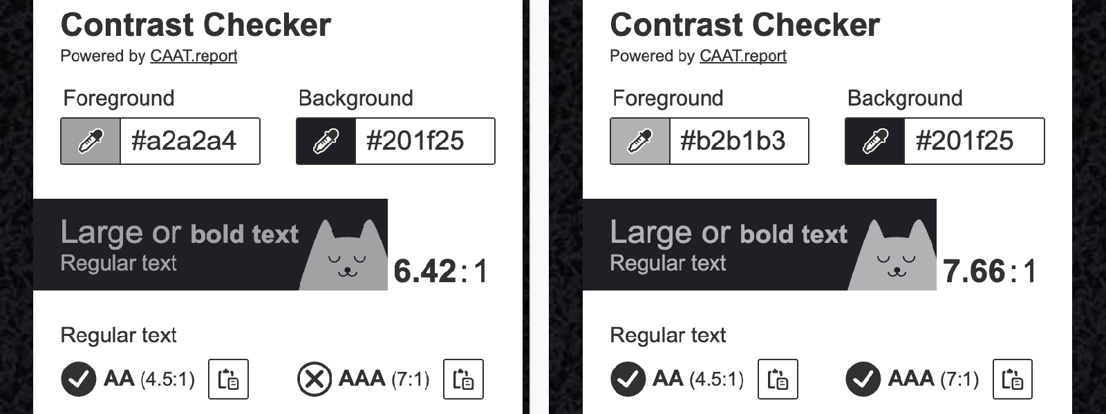
Using CAAT’s color contrast checker, we see that the foreground to background color ratio is 6.42:1. That easily passes the AA standard of 4.5:1 but does not pass the stricter AAA version of the color contrast standard of 7:1. That element had an opacity value of 0.67 set in CSS. By changing that value to 0.75, we bump the contrast up to 7.66:1. This is a great example of a change that doesn’t at all harm the design of the page but makes it so more people are able to enjoy Valerie’s insightful quote about our app. #winning
Alternative text
Most web platforms circa 2026 have the ability to support alternative text (usually called “alt text”) for images. You just need to know to look for the feature! There is some nuance to writing good alt text, but doing something is usually better than doing nothing. WebAIM has a thorough guide to writing alt text if you’re interested in leveling up in that area.
The other issues at the top of the WebAIM list take a bit more technical knowledge to fix and—in the case of form inputs and buttons—could be the difference between someone making a purchase on your site or not.
We want the web to be accessible to as many people as possible. That includes your site! If you’re now wondering how accessible your site is, get in touch and we’d be more than happy to take a look and let you know if your site presents barriers to people using screen readers free of charge!
Conclusion
The modern web is complex. There’s a lot to consider to create a frictionless website. But our bottom line is that people who visit your site shouldn't have to work to be your customers! It should work how people expect it to. Navigation should be straightforward. Form controls should be standard wherever possible. Content should be complete and up-to-date. Getting these simple things right can make a big difference in helping your website do what you actually want it to do: turn visitors into customers!
Hopefully, this article gives you some ideas for how to tweak your website to better serve your customers. If you’re dreading trying to implement these suggestions on your own site, get in touch. We live for this stuff, so we’d love to talk with you about how to help your website live its best life!